ad

Do you feel that you are Tableau Expert? Then try this challenge 6

Here I am coming with real time challenge. Those who are interested can try this and test your knowledge.

Initially some body asked me to post real time challenges. I am getting good responses to these posts. These challenges are to test your knowledge. I am not challenging anybody here to solve. I am just alerting people by using sentence “Do you feel that you are Tableau Expert?”. If really solve my challenges you will become expert definitly. How you are thinking is very important while solving challenges.

Here we go with one more challenge:


In 
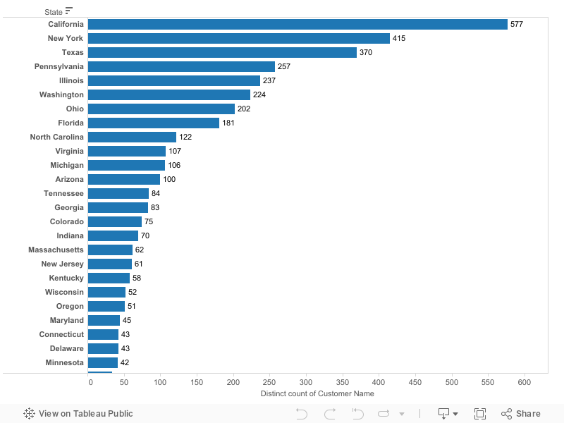
Above image at bottom, you are seeing 1,2,3….. 17. These are Number of Orders by Customer.

Color Indications:

Blue – Number of Customers does not return any Order. Means Zero Order returned.
Green – Number of Customers who returned only 1 Order.
Red – Number of Customers who returned only 2 Order.
Purple – Number of Customers who returned only 3 Order.

Explanation 1:

Now lets take bar which is showing 1 at bottom of the image.
Assume that 100 Customers placed only one Order. In that 100 Customers 92 people not returned any Order. But 8 People returned one Order.

Explanation 2:

Now lets take bar which is showing 12 at the bottom of the image.
Assume that 100 Customers placed 12 Order per each Customer. In those Customers 39 people not returned any Order. But 39 people returned only one Order, 17 people returned only 2 orders and 6 people returned 3 orders.

Explanation 3:

Now lets take bar which is showing 17 at the bottom of the image.
Assume that 100 Customers placed 17 Orders per each Customer. But non of them were not returned any Order.

Note: Please download the Data from below link to solve this challenge. If you use this data result should match with above image.

ClickHere to download Data


For more challenges: Click Here

Do you feel that you are Tableau Expert? Then try this challenge 5

Here I am coming with real time challenge. Those who are interested can try this and test your knowledge.

This is not expert level challenge. People are showing interest to solve these challenges. So I am just posting intermediate level challenge.

See below image:


In above chart I am showing % of unprofitable Customers in each State.

For example:

In “IllinoisState 57% of Customers has Profit less than zero.

Lets assume in “IllinoisState 100 Customers are there. In that 100 Customers, 57 Customers has Profit less than zero.


To Solve this challenge please download below workbook:


For more challenges: Click Here

Do you feel that you are Tableau Expert? Then try this challenge 4

Here I am coming with real time challenge. Those who are interested can try this and test your knowledge.


This challenge may look simple but once you solved this you will understand complexity.

I want to show chart like below:


In Above chart I am showing Number of customers who has profit ratio (ratio of profit vs sales) less than Yellow Threshold as red color, who has profit ratio between Yellow Threshold and Green Threshold as Yellow color. Finally we has profit ratio greater than Green Threshold as Green color.

Note: Yellow Threshold and Green Threshold are parameters created to change according to user requirements.

So in above Chart,

155 customers has less than 0 (-ve) profit ratio.
387 customers having profit ratio between 0 and 20.
251 customers has profit ratio more than 20.

Total 793 which shown in center of the Donut.

Please look at below images for more examples:

Example 1:

Example 2:

Example 3:


To Solve this challenge please download below workbook:


For more challenges: Click Here