- Multidimensional data sources do not support aggregations and binned data.
- Multidimensional data sources supports only in windows.
- You can use tableau to aggregate measures only with relational data sources, multidimensional data sources contain aggregated data only.
- Null values are ignored in median, count, sum, avg and countD.
- Median does not work on live connection.
- Median was not there before 8.2 version.
- Percentile required extract data. Percentile works with only extracts.
- When all measures are disaggregated you see a mark for each row in the view, you can't select marks to keep only, exclude or create a set when all measures are disaggregated.
- A dimension can be aggregated as a measure using minimum, maximum, count and count (distinct)
- Count (Distinct) is not support for Microsoft Access, Microsoft Excel and text files data sources. These data sources requires extract to work with CountD
- Dis-aggregating the data can result in a performance degradation.
- When you are writing formulas, any part that displays in bold indicates that it will be computed locally with in tableau on the aggregated results. Any normal weight text will be computed at the database level.
- Functions are displayed in Blue color while creating calculation field.
- Data window fields are displayed in Orange color while creating calculation field.
- Operators are displayed as Blank color while creating calculation field.
- Parameters are displayed as Purple color while creating calculation field.
- Comments are colored as Green color while creating calculation field.
- Grand Totals cannot be applied to continuous dimensions.
- The view must have at least one header to apply Grand Totals.
- If row headers are displayed you can calculate Grand Total for row, If column headers are displayed you can calculate Grand Total for column.
- Forecasting is not supported for multidimensional data sources.
- Forecasting doesn’t work if the view contains:(a) Table calculations(b) Disaggregated measures(c) Percent calculations(d) Grand Totals or Sub Totals(e) Date values with aggregation set to exact date(f) A time series contains null values also imposes constraints.
- The smaller the p-value, the more significant the model.
- If your data contains negative values tableau cannot plot them on a logarithmic scale. All values with a negative value will be displayed at 1 on the axis.
- The pattern match is not case sensitive in filters wild card match.
- If we are using multidimensional data source wild card match option is only available when filtering single level hierarchies and attributes.
- Filters cannot be applied across multiple data sources.
- In previous versions of tableau desktop, the All using this data source option was called make global and the only this worksheet option was make local.
- Sorted fields are identified by a sort icon on the right side of the field.
- You cannot nest inner joins within left or right joins. These joins will cause a "join expression not supported" error.
Important notes in Tableau Desktop
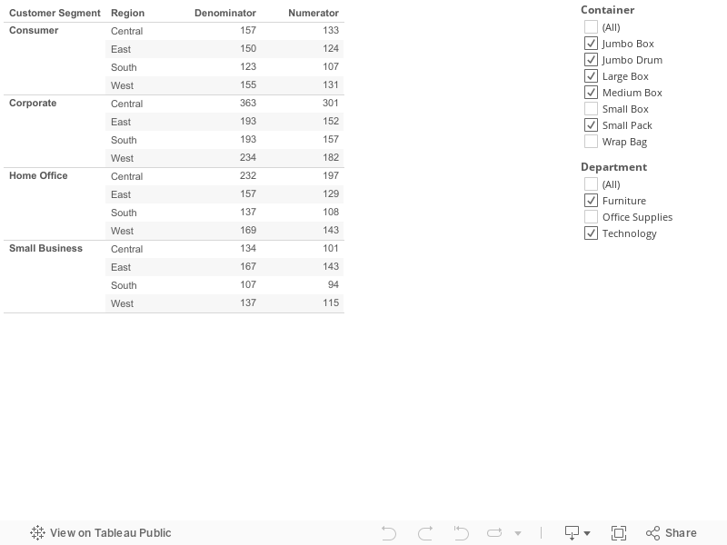
Scenario 4 (Applying filters only for numerator, not for denominator using FIXED( ) in Tableau 9)
Scenario
4:
Problem:
Applying filters only for numerator, not for denominator using FIXED
function in
Tableau 9
Description:
Lets take sample super
store data set. I want to see count distinct of “Order
Id” Group by “Customer Segment”
and “Region” as my Denominator. Here
is the tricky thing that I have two filters on filter shelf
“Container” and “Department”
But when I am calculating count distinct of “Order
Id” only one filter should apply to Denominator that is
“Container” See below:
Before applying
filters:

See above if I did not
apply filter then it showing Denominator and nominator both are same
values.
Now I am changing
“Container” filter. The filter will
apply to both Denominator and Numerator.

Now I am applying
“Department” filter. Now Only
numerator will change. The “Department”
filter wont apply to Denominator. See Below:

How
we can restrict filters on denominator?
Solution:
Step
1: Create a calculate field for “Numerator” using below formula.
Countd([Order
ID])
Step
2: Create a calculate field for “Denominator” using below
formaula.
{FIXED
[Customer
Segment],
[Region]:countd([Order
ID])}
Step
3: Drag columns to respective shelves like shown below, make
Container
filter as context filter.
- Drag “Customer Segment” and “Region” to row shelf
- Drag “Container” and “Department” to filters shelf
- Right click on “Container” column in filter shelf and click on “Add to Context”
- Drag “Numerator” and “Denominator” to text shelf
- Go to Show me and select text table

Now
you can change filters and observe that “Container”
filter is applying only for Denominator.
You
can see that “Container”
and “Department”
filters are applying to numerator.
See the report below:
See the report below:
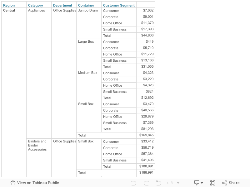
Scenario 3 ( Removing Subtotals for unwanted columns)
Scenario
3: (Simple)
Problem:
When we add subtotals by default it will add subtotals for each
dimension in cross tab report.
Description:
Lets take sample
superstore dataset. I made one cross tab report with following
columns in same order.
Region,
Category, Department, Container, Consumer Segment and Sales.
After adding subtotals
report look like this:

In above report I don't
want totals for Category and Region.
How
to remove subtotals for unwanted columns?
Solution:
Step
1: Build
cross tab report using following columns.
Drag
Region,
Category, Department, Container, Consumer Segment Columns
to row shelf. Drag sales
column to text Self.

Step
2: Add
Subtotals to report. Go to Analysis
tab, select Totals
and click on Add All Subtotals

Now
the report looks like this:

Step
3:
Right click on Region
column which is there in row shelf to remove subtotals. By default it
is selected, Click on Subtotals
to
remove subtotals.

Step
4:
Repeat step 3 for
Category
column to remove subtotal.
After
removing subtotals for Region
and Category
the report looks like this:

See the report below:
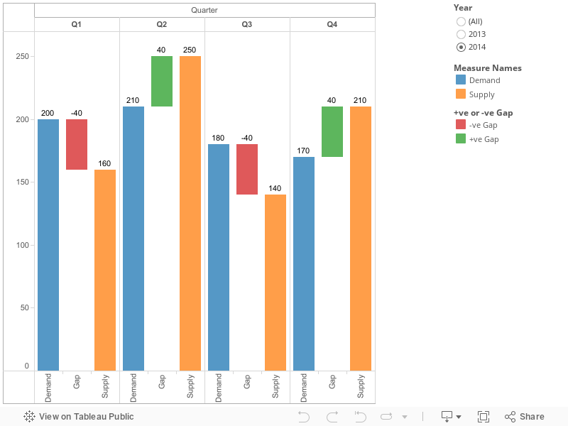
Scenario 2 (Gap Analysis using floating Bar chart)
Scenario
2: (Complex)
Problem:
Gap
analysis between demand vs supply with floating gap bar along with
conditional formatting. See below image.

Gap =
Supply - Demand
Description:
- The gap that is Supply – Demand should display in between supply and demand bars.
- If the gap is -ve mean supply is less than demand then gap bar should be in red color or if the gap is +ve means supply is more than demand then gap bar should be in green color.
- In the same way gap bar should start from end of demand bar if it is less than supply or it should start from end of supply bar if is less than demand.
Questions
that I raised:
- How to display Gap bar between Demand and Supply in floating mode.
- How to make Gap bar start from end of either Demand or Supply (start point depends upon which one is low among Demand and Supply)
- How to do conditional formatting for floating bar.
Solution:
please
follow step by step clearly
This
report build with sample data that I prepared please see the sample
data

Step
1: In
present dataset we don’t have gap so we need to calculate gap using
below formula. Create a calculated field “Supply - Demand (Gap)”
[Supply]
- [Demand]
Step
2:
Create a calculated field for conditional formatting as “+ve or -ve
Gap” (solution of my 3rd
Question)
if
[Supply
- Demand (Gap)] <
0 then "-ve Gap" else "+ve Gap" END
Step
3:
Drag year column to filter and select 2014. Drag Quarter column to
column shelf , Drag Demand , Supply columns to row shelf. Go to Show
me and select side by side bar. You will see like this

Step
4:
Create a calculated field as “Gap (ABS)” to get the Absolute
value of Gap.
float(abs([Supply
- Demand (Gap)]))
Step
5:
Create a calculated field “Gap” to make the starting point of
floating bar. This will depend upon Demand and Supply values. Which
is low among these two will become start point for floating bar.
if
sum([Supply])
> sum([Demand])
then float(sum([Demand]))
else float(sum([Supply]))
END
Step
6:
Drag “Gap” column that created in step 5 to rows shelf, beside
“Measure Values”. See below

Step
7: Right click on “Gap” axis and select dual axis. If is not
showing bar chart then go to marks shelf and select bar. It should
like this

Step
8:
Right click on “Gap” axis which on right side and select
“Synchronize Axis”, again right click and click on Show Header.
Then the right side Axis will go hide.
Step
9:
Go to Marks shelf, select “Gantt Bar” in Gap marks shelf drop
down.

Step
10:
Drag “Gap (ABS)” field which is created in step 4 to size shelf.
Now you will see floating gap bars in chart.

Step
11:
Drag conditional formatting calculated field “+ve or -ve Gap”
which is created in step 2 to Gap marks shelf.

After
adding conditional formatting field to Gap marks shelf report will
looks like this:

Step
12:
Now we have to show labels to bars. Just click on “Abc” from tool
bar and format labels to standard format.


Step
13:
See the label for gap floating bar it showing either Demand or Supply
values because we use them for starting point of float bar. So we
need to change this label. Go to label shelf of Gap marks shelf,
unchecked show mark labels.

Step
14:
Now Drag “Supply - Demand (Gap)” field which created in step 1 to
label shelf of Gap Marks Shelf. Finally report is completed.

See the report below:
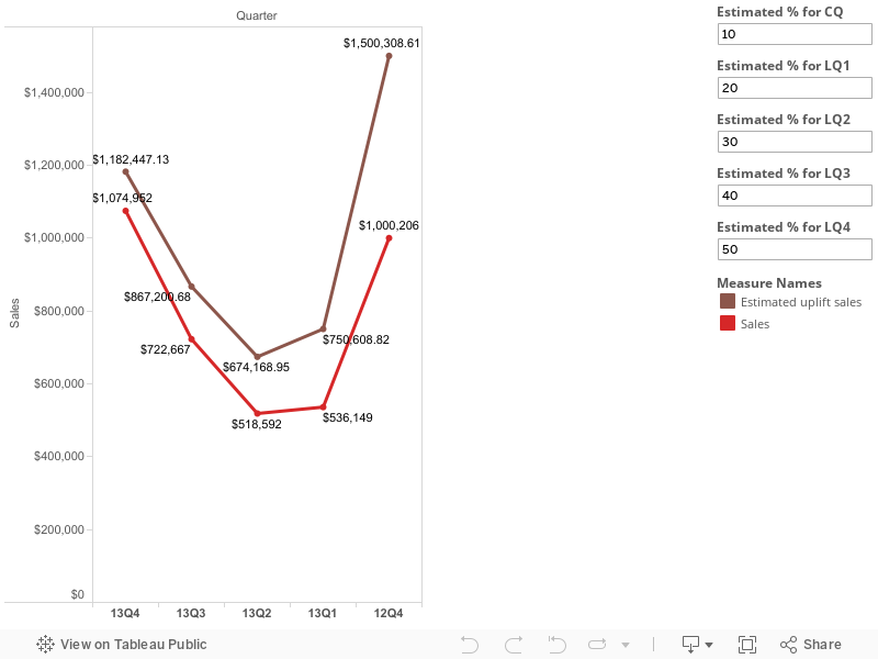
Scenario 1 (Mapping 5 parameters to top 5 Quarters)
Scenario
1 (Medium)
Problem:
we need to map each parameters to corresponding quarter to
calculate estimated uplift sales.
Description:
Lets take sample
superstore subset data set. I am more interested to see top 5
quarters of sales in my data set. I plot a line graph like below:

13Q4, 13Q3, 13Q2, 13Q1
and 12Q4 are my latest quarters in present dataset.
Note: assume
that 13Q4 as my current quarter and follows other as
13Q3 as LQ1
13Q2 as LQ2
13Q1 as LQ3
12Q4 as LQ4
Now I want to show one
more line with estimated % of increase in sales. I will pass
estimated % values for each Quarter using parameters.
My Parameters list:
Estimated % for
CQ
Estimated % for
LQ1
Estimated % for
LQ2
Estimated % for
LQ3
Estimated % for
LQ4
Now I need to calculate
Estimated sales for each quarter using following formula
if attr(quarter)
= '13Q4' then sum(sales)
+ (sum(sales)
* (Estimated % for CQ/100))
elseif attr(quarter)
= '13Q3' then sum(sales)
+ (sum(sales)
* (Estimated % for LQ1/100))
elseif attr(quarter)
= '13Q2' then sum(sales)
+ (sum(sales)
* (Estimated % for LQ2/100))
elseif attr(quarter)
= '13Q1' then sum(sales)
+ (sum(sales)
* (Estimated % for LQ3/100))
elseif attr(quarter)
= '12Q1' then sum(sales)
+ (sum(sales)
* (Estimated % for LQ4/100))
END
The above formula
should run for each row in the data set. But we cant hard code these
quarters like 13Q4, 13Q3 …...12Q1 because these data will come
dynamically from data source. In future you may see 14Q4,
14Q3....13Q1
Here
is the problem how to know which quarter is coming in current row? I
mean is CQ or LQ1 or LQ2 or LQ3 or LQ4?
Solution:
After
Knowing the solution you might feel simple. But this logic I got
after several trials.
First
create a 5 parameters with following names
Estimated % for
CQ
Estimated % for
LQ1
Estimated % for
LQ2
Estimated % for
LQ3
Estimated % for
LQ4
Just remember once
again the calculate field for Estimated uplift sales:
if attr(quarter)
= '13Q4' then sum(sales)
+ (sum(sales)
* (Estimated % for CQ/100))
elseif attr(quarter)
= '13Q3' then sum(sales)
+ (sum(sales)
* (Estimated % for LQ1/100))
elseif attr(quarter)
= '13Q2' then sum(sales)
+ (sum(sales)
* (Estimated % for LQ2/100))
elseif attr(quarter)
= '13Q1' then sum(sales)
+ (sum(sales)
* (Estimated % for LQ3/100))
elseif attr(quarter)
= '12Q1' then sum(sales)
+ (sum(sales)
* (Estimated % for LQ4/100))
END
In Above formula we
need to replace 13Q4,13Q3 …..12Q1 dynamically. Let think that if I
give positions for top 5 quarters as below
Top Quarter in data set
---> position as 1 and follows see below example
13Q4 ----> 1 and see
I can map this to CQ parameter
13Q3 ----> 2 this to
LQ1 parameter
13Q2 ----> 3 this to
LQ2 parameter
13Q1 ----> 4 this to
LQ3 parameter
12Q4 ----> 5 this to
LQ4 parameter
how to give
positions to Quarters?
Using rank function we
can give positions to quarters dynamically.
Create a calculate
field as “Rank Quarter” using below formula.
rank(attr([Quarter]))
now you will see like
this
this rank will update
for future quarters.

Now we will write
calculation field for Estimated uplift sales using Rank Quarter
field.
if [Rank
Quarter] = 1 then sum(Sales)
+ (sum(Sales)
* ([Estimated % for CQ]/100))
elseif [Rank
Quarter] = 2 then sum(Sales)
+ (sum(Sales)
* ([Estimated % for LQ1]/100))
elseif [Rank
Quarter] = 3 then sum(Sales)
+ (sum(Sales)
* ([Estimated % for LQ2]/100))
elseif [Rank
Quarter] = 4 then sum(Sales)
+ (sum(Sales)
* ([Estimated % for LQ3]/100))
elseif [Rank
Quarter] = 5 then sum(Sales)
+ (sum(Sales)
* ([Estimated % for LQ4]/100))
END
Now place the columns
in respective shelves and make a dual axis chart like below

Note:
I did not include two
things above.
1. calculation field to
extract “Quarter” column from “Order Date” column
right(str(year([Order
Date])),2) + 'Q' + str(datepart('quarter',[Order
Date]))
2. Applying top 5
filter on Quarter column to see top 5 quarters

See the report below: