Scenario
2: (Complex)
Problem:
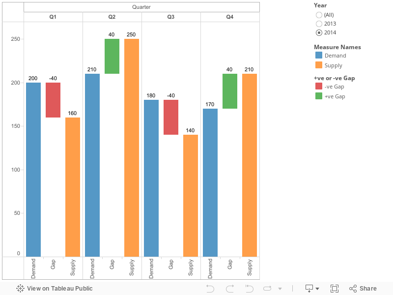
Gap
analysis between demand vs supply with floating gap bar along with
conditional formatting. See below image.

Gap =
Supply - Demand
Description:
- The gap that is Supply – Demand should display in between supply and demand bars.
- If the gap is -ve mean supply is less than demand then gap bar should be in red color or if the gap is +ve means supply is more than demand then gap bar should be in green color.
- In the same way gap bar should start from end of demand bar if it is less than supply or it should start from end of supply bar if is less than demand.
Questions
that I raised:
- How to display Gap bar between Demand and Supply in floating mode.
- How to make Gap bar start from end of either Demand or Supply (start point depends upon which one is low among Demand and Supply)
- How to do conditional formatting for floating bar.
Solution:
please
follow step by step clearly
This
report build with sample data that I prepared please see the sample
data

Step
1: In
present dataset we don’t have gap so we need to calculate gap using
below formula. Create a calculated field “Supply - Demand (Gap)”
[Supply]
- [Demand]
Step
2:
Create a calculated field for conditional formatting as “+ve or -ve
Gap” (solution of my 3rd
Question)
if
[Supply
- Demand (Gap)] <
0 then "-ve Gap" else "+ve Gap" END
Step
3:
Drag year column to filter and select 2014. Drag Quarter column to
column shelf , Drag Demand , Supply columns to row shelf. Go to Show
me and select side by side bar. You will see like this

Step
4:
Create a calculated field as “Gap (ABS)” to get the Absolute
value of Gap.
float(abs([Supply
- Demand (Gap)]))
Step
5:
Create a calculated field “Gap” to make the starting point of
floating bar. This will depend upon Demand and Supply values. Which
is low among these two will become start point for floating bar.
if
sum([Supply])
> sum([Demand])
then float(sum([Demand]))
else float(sum([Supply]))
END
Step
6:
Drag “Gap” column that created in step 5 to rows shelf, beside
“Measure Values”. See below

Step
7: Right click on “Gap” axis and select dual axis. If is not
showing bar chart then go to marks shelf and select bar. It should
like this

Step
8:
Right click on “Gap” axis which on right side and select
“Synchronize Axis”, again right click and click on Show Header.
Then the right side Axis will go hide.
Step
9:
Go to Marks shelf, select “Gantt Bar” in Gap marks shelf drop
down.

Step
10:
Drag “Gap (ABS)” field which is created in step 4 to size shelf.
Now you will see floating gap bars in chart.

Step
11:
Drag conditional formatting calculated field “+ve or -ve Gap”
which is created in step 2 to Gap marks shelf.

After
adding conditional formatting field to Gap marks shelf report will
looks like this:

Step
12:
Now we have to show labels to bars. Just click on “Abc” from tool
bar and format labels to standard format.


Step
13:
See the label for gap floating bar it showing either Demand or Supply
values because we use them for starting point of float bar. So we
need to change this label. Go to label shelf of Gap marks shelf,
unchecked show mark labels.

Step
14:
Now Drag “Supply - Demand (Gap)” field which created in step 1 to
label shelf of Gap Marks Shelf. Finally report is completed.

See the report below: