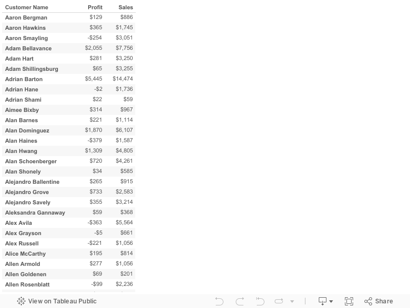
Here I am coming with real time challenge. Those who are interested can try this and test your knowledge.
This challenge may look simple but once you solved
this you will understand complexity.
I want to show chart like below:

In Above chart I am showing Number of customers
who has profit ratio (ratio of
profit vs sales)
less than Yellow Threshold as red
color, who has profit ratio
between Yellow Threshold and
Green Threshold as Yellow
color. Finally we has profit ratio
greater than Green Threshold as
Green color.
Note:
Yellow Threshold and
Green Threshold are parameters
created to change according to user requirements.
So in above Chart,
155 customers
has less than 0 (-ve) profit ratio.
387 customers
having profit ratio between 0 and
20.
251 customers
has profit ratio more than 20.
Total 793 which shown in center of the Donut.
Please look at below images for more examples:
Example 1:

Example
2:

Example
3: